TAHATŪ – HOMEPAGE
Tahatū Career Navigator helps New Zealanders explore study and career pathways.
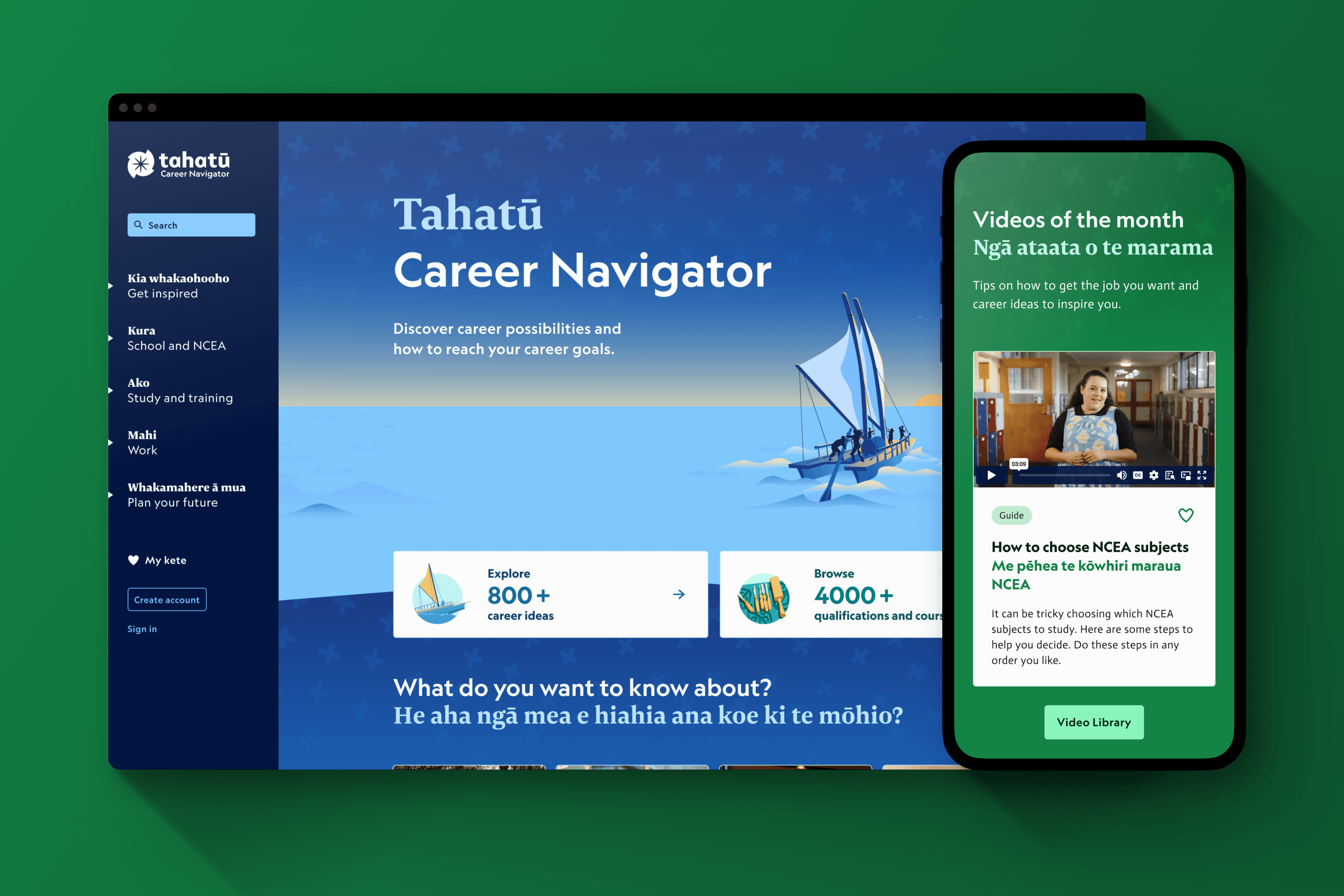
The homepage was redesigned to better reflect the platform’s scale and value, simplifying navigation, improving wayfinding, and making key tools easier to access, resulting in a clearer and more engaging entry point for users.
role
Senior Product Designer
Client
Tertiary Education Commission
MY IMPACT
Led end-to-end design for the Tahatū homepage, overseeing both UX and UI. Used user insights and testing to improve navigation, content discovery, and engagement, collaborating with stakeholders and developers to deliver a clear, accessible, and user-centered experience.
pROBLEM
The purpose and value of Tahatū were unclear, making it difficult for users to understand what the platform offered or where to start.
Navigation was confusing, with key tools buried and hard to access, reducing discoverability and engagement.
The homepage did not reflect the platform’s scale and needed to better support diverse users within a complex government content ecosystem.
User
mindsets
We identified key user mindsets that shaped how the homepage communicates value, supports navigation, and surfaces key content.
These insights guided clearer entry points, improved wayfinding, and a more intuitive content hierarchy to help users quickly understand what Tahatū offers and where to start.
1
Early Explorers
Needed guidance on post-school options.
2
Goal-Focused Users
Wanted quick access to study, training, and career tools.
3
Career Transitioners
Exploring new directions and options.
4
Uncertain Starters
Needed reassurance and clear guidance.
RESEARCH INSIGHTS
Here is what we learned about our users through research and user interviews.


SOLUTION
The homepage was redesigned to clearly communicate Tahatū’s purpose, guide users to key content, and create an engaging, intuitive entry point, guided by core design principles.
Clear wayfinding for fast discovery.
Culturally relevant design.
Engaging visuals and interactions.
Flexible, modular layouts.
SKETCHES & WIREFRAMES
Explored layouts, content grouping, and navigation through wireframes and A/B testing, iterating with user and stakeholder feedback to create a clear, engaging, and adaptable homepage experience.

PROTOTYPES
AI-assisted tools, including Figma Make and Claude, were used to rapidly generate variations, accelerate iteration, and identify friction points, enabling faster, data-informed design decisions.
user
testing
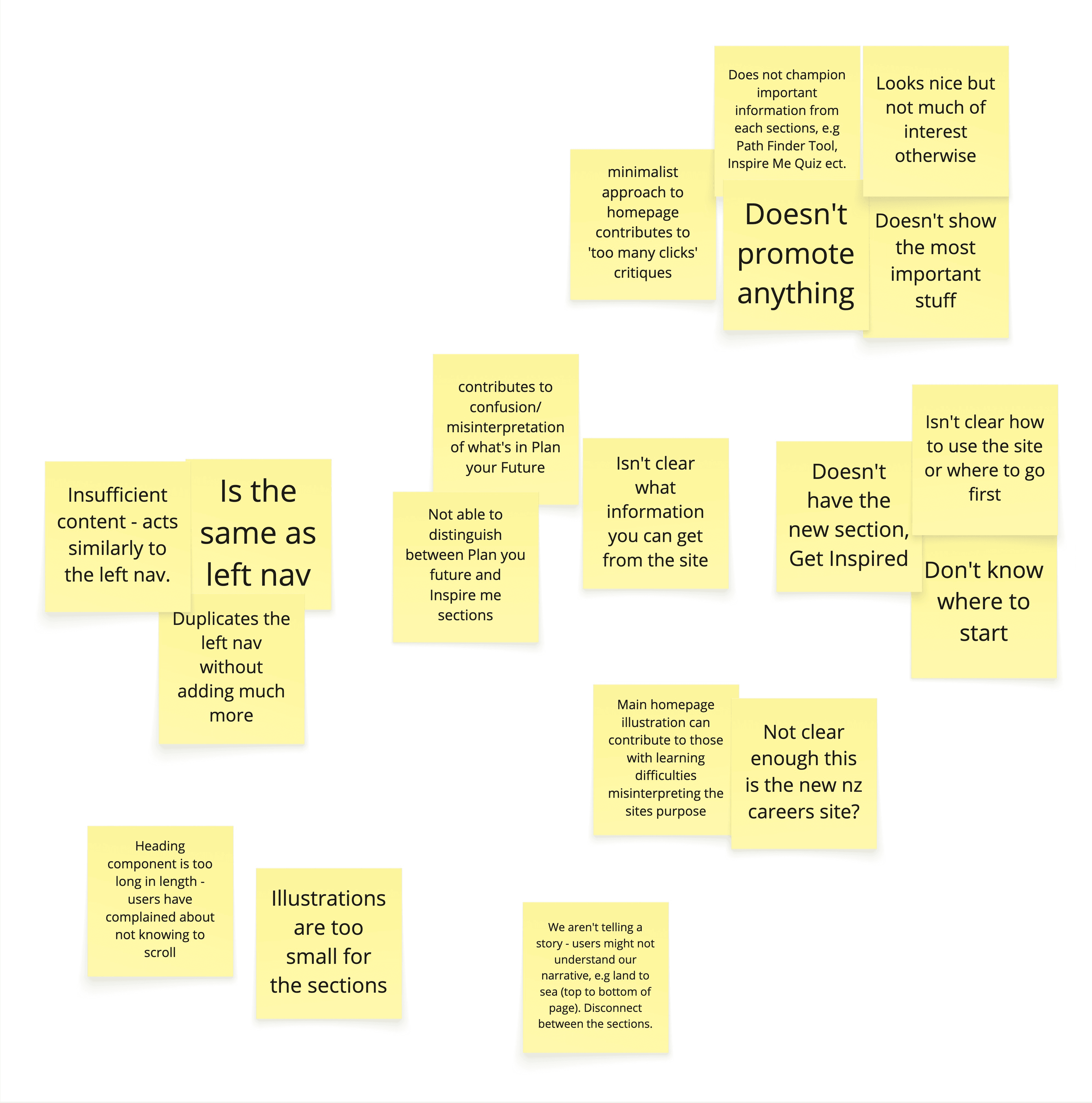
Conducted usability testing with secondary school students and parents to evaluate navigation, clarity, and content discoverability across two homepage design options, using insights to guide iterative improvements for a clearer, more engaging experience.


Here is what we learned about our users through user testing.
Users relied on navigation and search, missing some clickable elements.
Practical content like pay, CVs, and guidance was highly valued.
Excessive scrolling led to missed content.
Busy layouts and heavy photography caused overwhelm.
Some users wanted clear starting points, others preferred self-exploration.
Video playback was not always clear.
ITERATION
After several rounds of user testing and analysis, the Interest Quiz was refined to enhance usability, responsiveness, and clarity, leading to the following key updates.
We ran a second round of homepage testing with students to compare Option A and B, focusing on task completion, engagement with quizzes, videos and tools to assess how layout and content presentation impacted usability and discoverability.
OPTION A
Busy layout and heavy imagery lowered preference, though some liked richer content.
Background imagery caused navigation assumptions.
Explore buttons and large stats drove engagement.
Catchall resources helped users find missed content.
Task groups and accordions were often missed.
Video expectations were mixed.
Quiz driver was clear and performed well.
OPTION B
Simpler layout and clear visuals improved preference.
Interests Quiz was clear; word matching aided discovery.
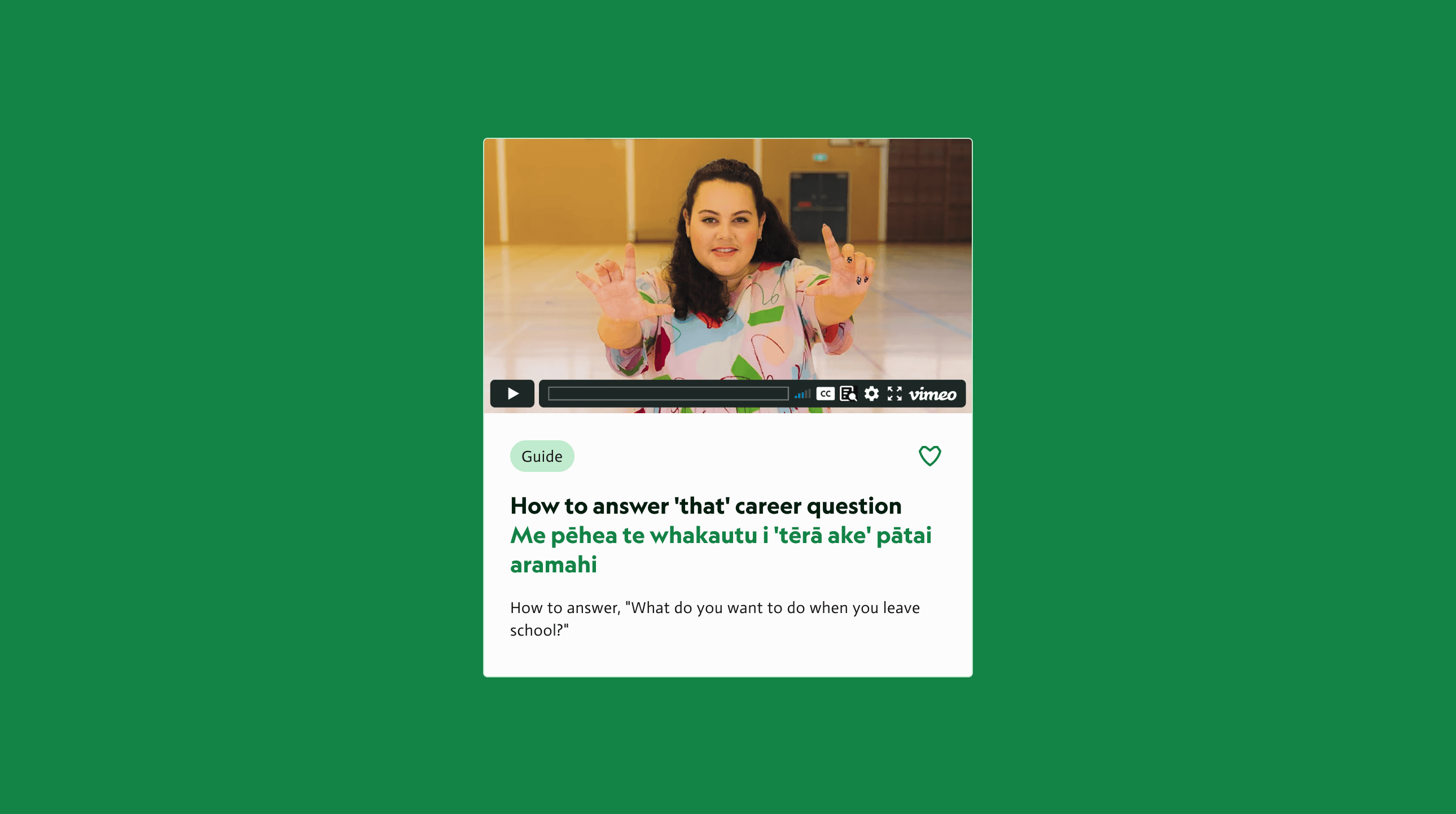
Videos of the Week drove higher engagement.
News and Tips section had no engagement.
Task groups were easier to understand and notice.
KMO driver more visible due to higher placement.
Get Advice carousel and clear section separation were appreciated.
user interface
Led the homepage UI, using A/B testing to improve clarity, discoverability, and engagement for diverse users.
Wayfinding
Designed SODA-based peel-aparts and task group cards with photography and dual language headings to help users quickly find tools, videos, and career content.


Engaging content display
Dual-card layout combines videos with related career ideas, surfacing key information without extra clicks; Videos of the Week and catchall sections increase discovery of popular resources.

Catchall for key tools
Introduced a dedicated catch-all section surfacing important tools, explore drivers, and popular guides in one place, improving discoverability and reducing reliance on left navigation.


Breakpoints

Looking ahead
Opportunities to further improve usability, clarity, and long-term product impact.
Test scroll and page length to reduce overwhelm.
Improve placement of videos and stats.
Highlight guides, news, and catch-all resources for easier discovery.