Tapi is a property-management platform that helps property managers track and action maintenance jobs.
The Jobs page was redesigned to improve clarity and efficiency, refining table structure, interactions, and visual design to make key information easier to scan and support faster, more confident task completion across large property portfolios.
role
UX / UI Designer
Client
Tapi
Led end-to-end UX and UI design for the table redesign, from concepts to high-fidelity prototypes. Used research and feedback from property managers to improve clarity, task flow, and efficiency, collaborating closely with engineering and stakeholders to deliver a user-centered, accessible, and actionable interface.
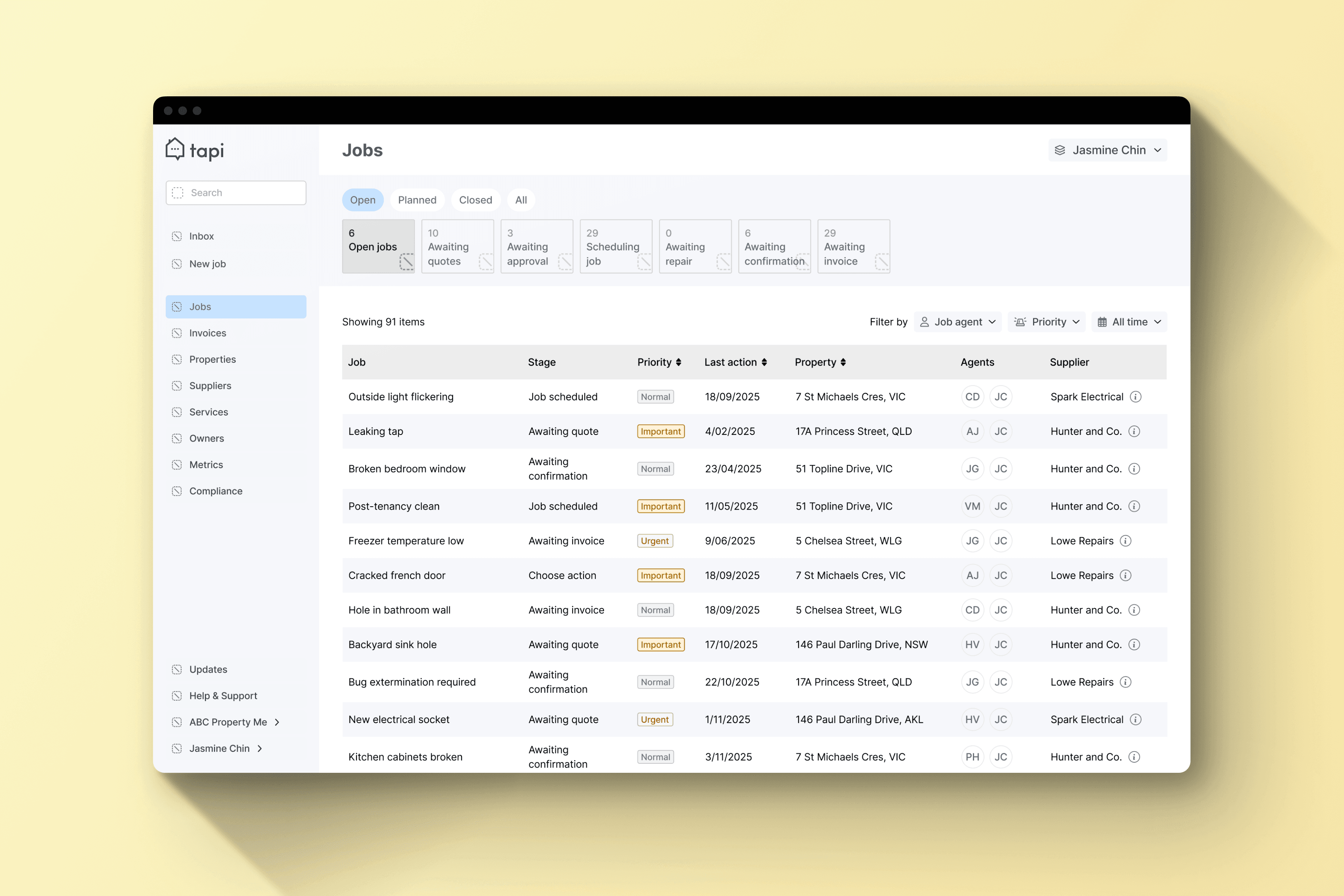
Property managers struggled to scan and prioritise maintenance jobs efficiently, as the existing card layout hid key information and limited visibility.
High scrolling and unclear hierarchy slowed workflows, and the platform needed a scalable, data-friendly table layout to support faster, more confident task completion across large property portfolios.
We identified key property manager mindsets that shaped how the Jobs page displays and prioritises information.
These insights guided clearer table layouts, improved task visibility, and intuitive interactions, helping managers quickly scan, prioritise, and act on maintenance jobs across large property portfolios.
1
Efficient Users
Need to complete jobs quickly with minimal clicks.
2
Overloaded Users
Manage large portfolios and need to prioritise efficiently.
3
Support-seeking Users
Junior property managers who rely on clear guidance to stay productive.
4
Analytical Users
Track trends and workloads, valuing sortable and actionable data.

The Jobs page was redesigned to improve task visibility, prioritisation, and efficiency, exploring layouts, table structures, and sorting/filtering options to create a clearer, more usable interface guided by core design principles.
Highlight key info for quick scanning.
Enable intuitive sorting and filtering.
Keep layouts scalable for large portfolios.
Explored layouts, table structures, and sorting options through sketches and wireframes, iterating with feedback to create a clear, efficient, and adaptable Jobs page.


Built interactive table prototypes in Figma to test navigation and sorting, gathering feedback from property managers to identify friction points.
Conducted usability testing with property managers to evaluate navigation, task flow, and access to related Supplier and Property pages, using insights from early prototypes to identify friction points and guide iterative improvements to the Jobs page.
First round testing
Reduced card padding to display more jobs on screen.
Surfaced the most important information first; de-emphasised less critical fields like Supplier name.
Added sorting by urgency, date, and property to prioritise tasks faster.
Separated priority and stage to reflect distinct mental models (urgency vs workflow).
Second round testing


Reordered columns to surface priority, stage, and job title.
Separated priority and stage for clearer decision-making.
Moved Supplier details to a hover tooltip to reduce clutter.
Improved hover states and clickable areas for smoother interactions.
Led the table and data-heavy screen redesign in Tapi Manager, using prototypes and testing to improve scanability, clarity, and overall usability for property managers.

Opportunities to further improve usability, clarity, and long-term product impact.
Allow property managers to customise visible columns.
Improve filtering and sorting functionality.
Explore bulk actions to speed up repeat tasks.
Test changes earlier and gather feedback sooner to catch friction points sooner.