Interest Quiz – Tahatū
Tahatū Career Navigator helps New Zealanders explore study and career pathways.
A new interest quiz was designed to reduce overwhelm and guide clearer decisions, increasing completion and improving user confidence.
role
Senior Product Designer
Client
Tertiary Education Commission
MY IMPACT
Led UI design and contributed across UX, collaborating with stakeholders and developers to deliver a streamlined, intuitive quiz experience that improved usability, engagement, and user confidence.
pROBLEM
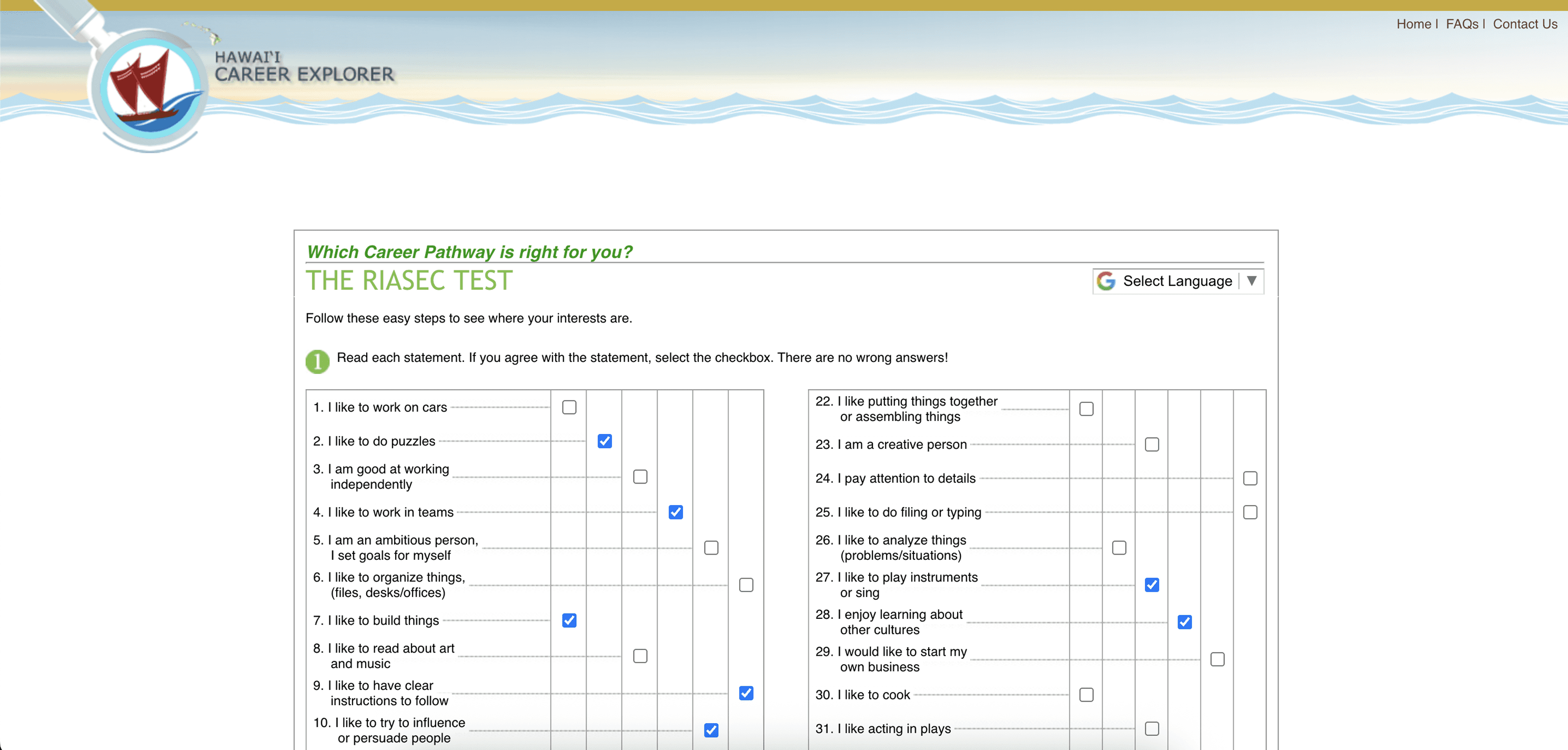
Existing career tools felt long, outdated, and overwhelming, leading to disengagement before completion.
Users struggled to understand how their answers translated into meaningful work areas and career pathways, reducing trust in the results.
The experience also needed to resonate with younger audiences while operating within a complex government content ecosystem.
User
mindsets
We identified key user mindsets that shaped how the quiz guides, paces, and presents information.
These insights guided progressive steps to reduce overwhelm, simplified entry points, and informed visual cues and language to support comprehension across all users.
RESEARCH INSIGHTS
Here is what we learned about our users through research and user interviews.
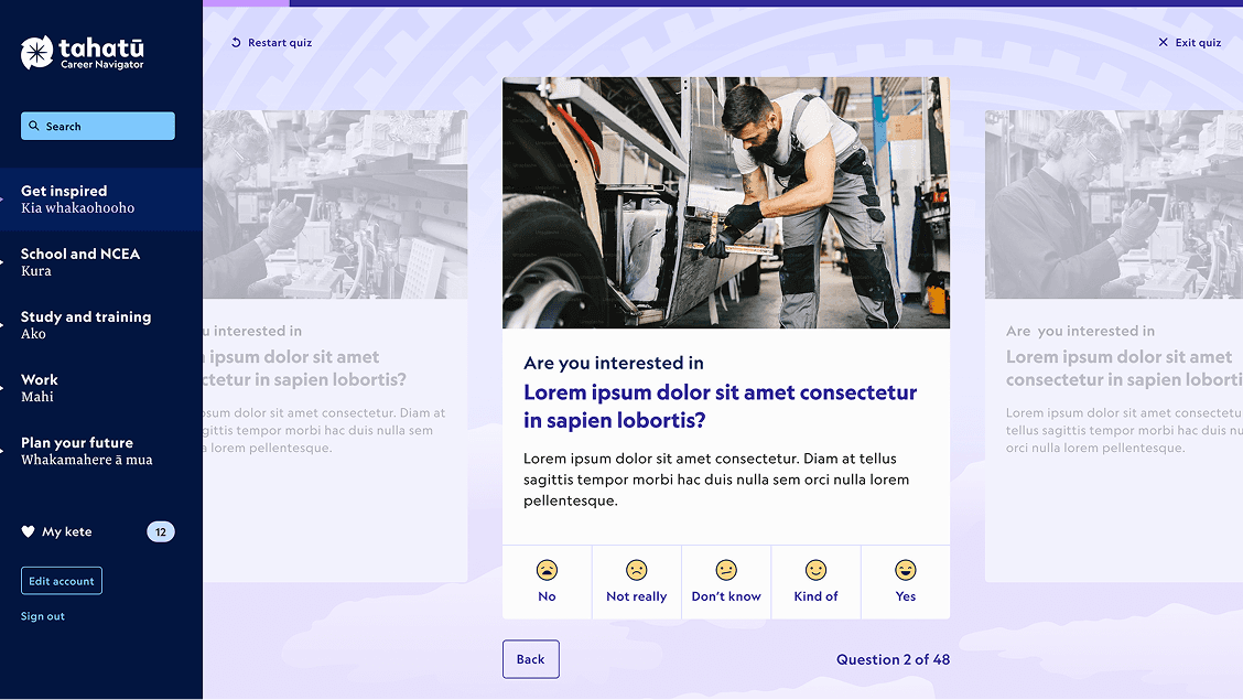
Users wanted a quick, clear, and approachable quiz.
Results needed to feel meaningful and trustworthy.
Visual cues and simple language were key to keeping engagement high.
Access had to work for both logged-in and logged-out users without compromising privacy.


SOLUTION
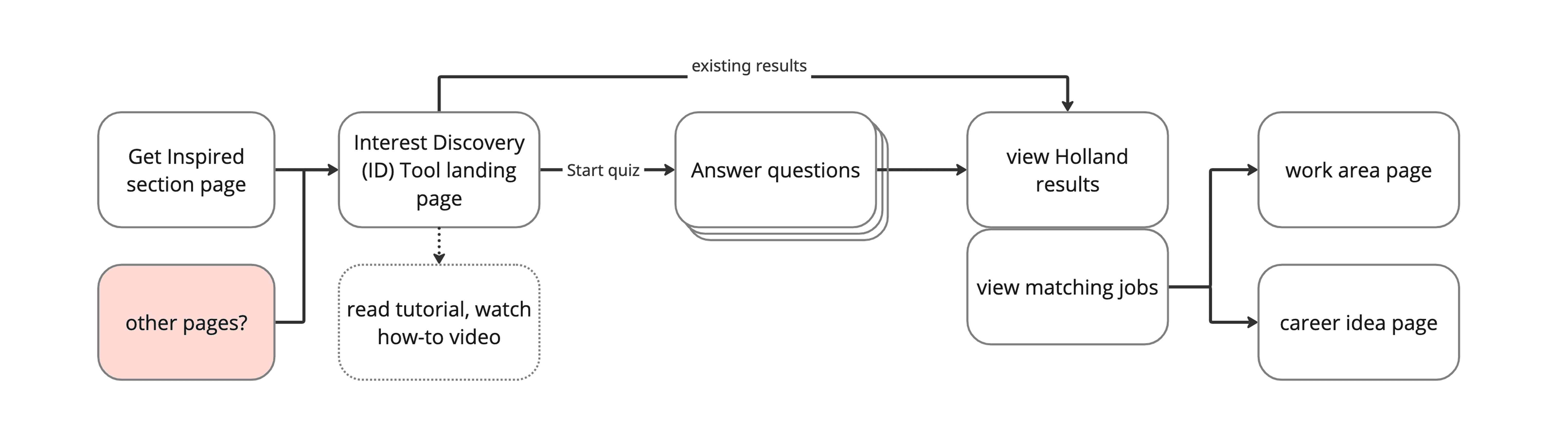
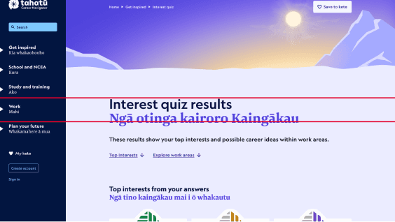
A new interest quiz simplifying career exploration, guiding users step-by-step and making results clear.
Key design principles shaped layouts, interactions, and prototypes, creating an intuitive, engaging experience for diverse users.
Reduce cognitive load and guide users step-by-step.
Make logic visible to build trust.
Design for clarity and scalability.


user
testing
Conducted classroom and online usability sessions and used Hotjar and Google Analytics to uncover friction points and guide iterative improvements for a clearer, more engaging quiz experience.


Here is what we learned about our users through user testing.
Users preferred multiple-choice questions; some wanted an “Unsure” option.
Users found it unclear how to start or reach the quiz, with too many steps or hard-to-find entry points.
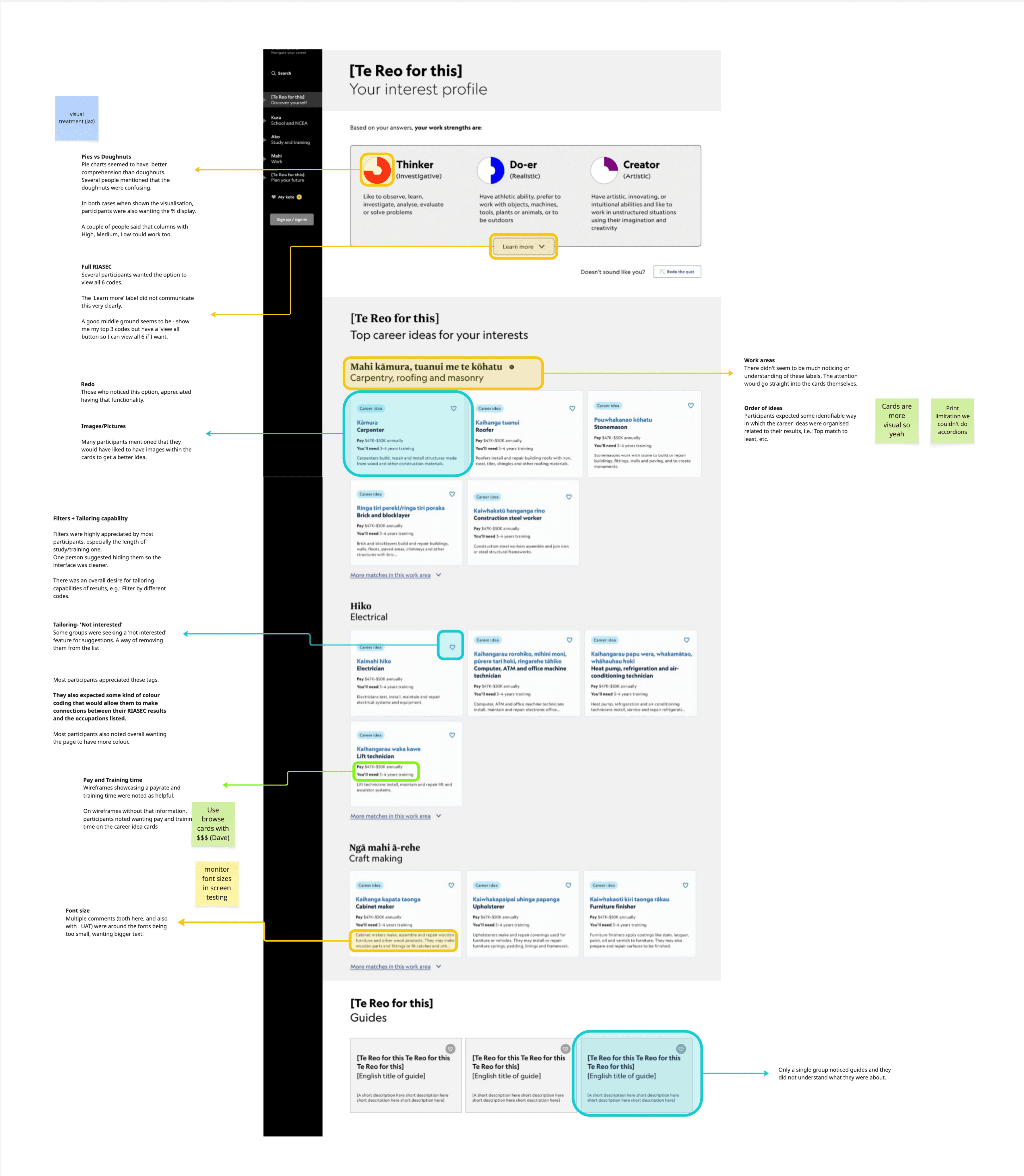
Users saw little connection between quiz results and related occupations.
Some users’ desktop screens cut off question cards, making it hard to see or answer.
Many users spam the browser ‘back’ button to restart the quiz.
Most users stop scrolling after ‘Top interests,’ missing more results below.


ITERATION


user interface
Led all visual design for the quiz, ensuring results were intuitive, engaging, and culturally informed, while enabling users to explore and save their interests seamlessly.
Iconogrpahy
Designed RIASEC score icons using Tahatū weaving and tukutuku patterns, with clear progress states to make results easy to interpret. Cultural guidance was reviewed with the Pou Ārahi for appropriateness.


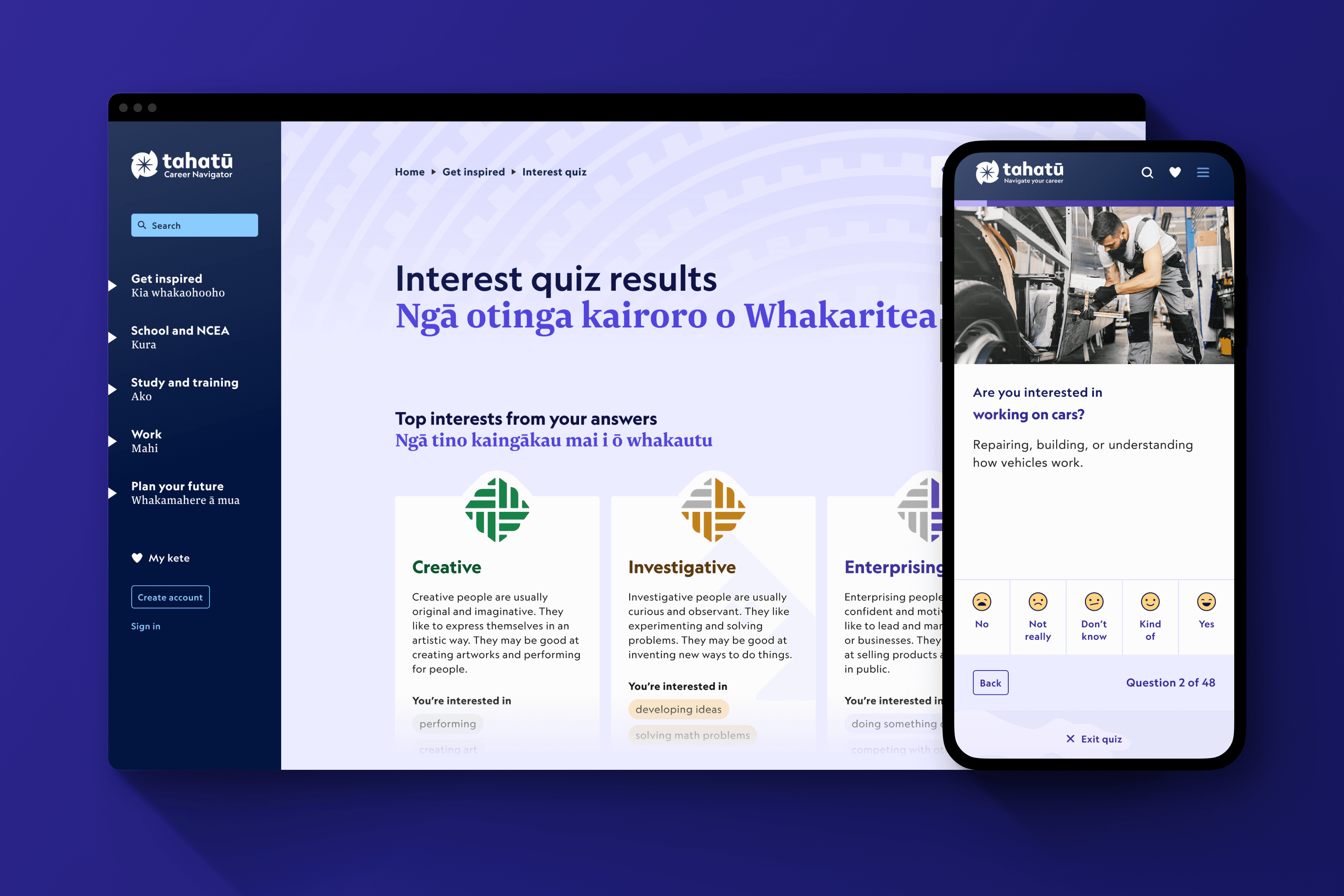
Interest Card
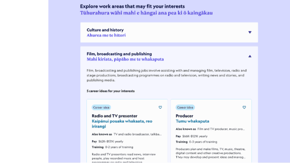
Designed interactive cards showing top 3 interests and suggested work areas, appearing on the quiz landing page, results page, and users’ kete. Cards link to detailed quiz results and include confirmation modals for deletions.


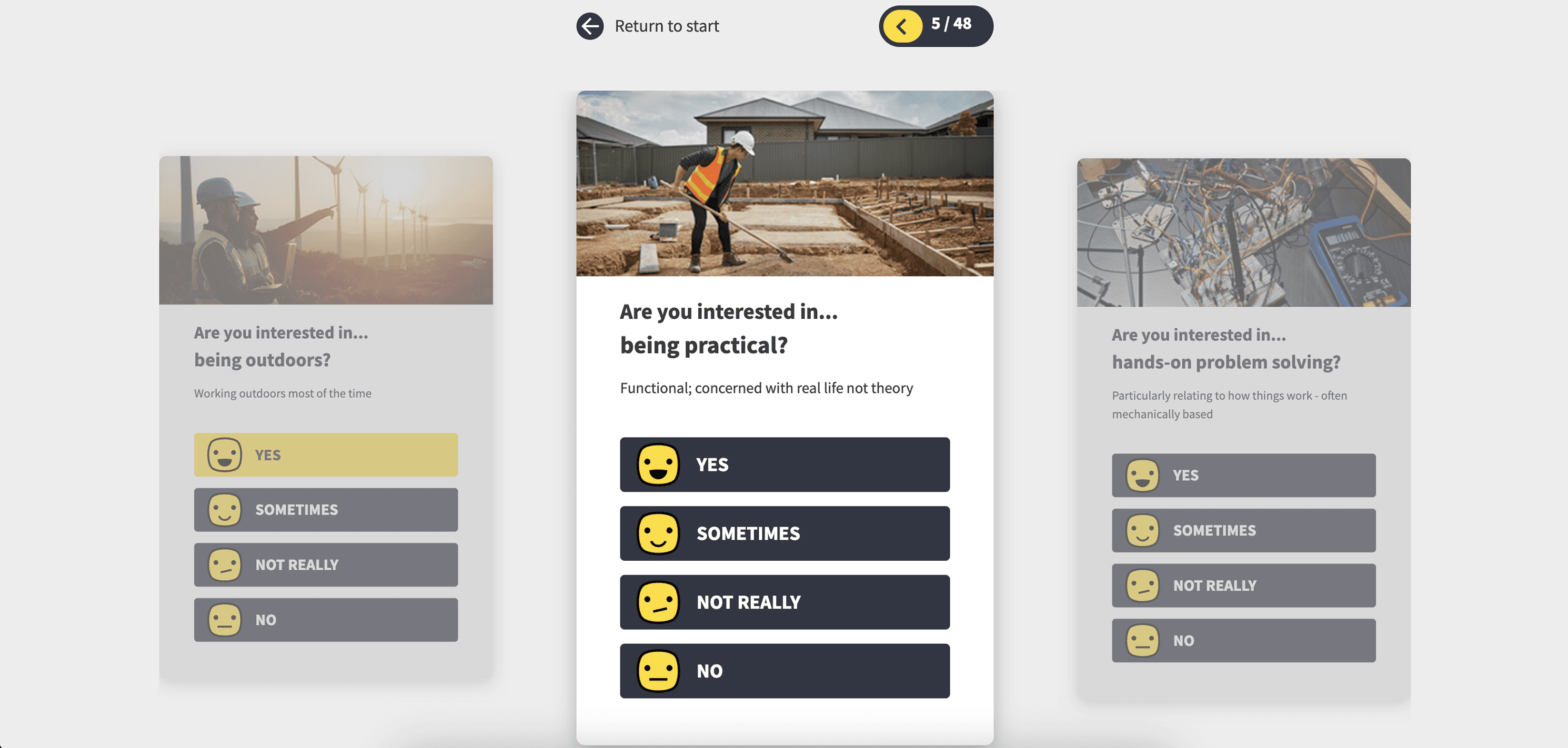
Quiz page
Structured the question cards and 48-card carousel, ensuring clarity, visual consistency, and responsiveness across mobile and desktop devices.

Landing page
Illustrated and structured the landing page across states (default, already done, resume), including headers, tutorials, guide carousels, and top interest sections, optimised for desktop and mobile.

Breakpoints

Looking ahead
Opportunities to further improve usability, clarity, and long-term product impact.
Introduce usability testing earlier to catch issues sooner.
Refine results to improve clarity and trust.
Enable saving and revisiting quiz attempts.